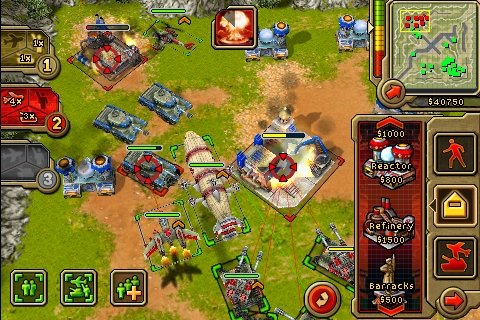
 We’ve been lucky enough to be able to get out hands on a preview copy of EA’s Command & Conquer Red Alert. While I admit it’s been at least ten years since I played the PC version of the game, the look and feel seems to be remarkably intact, but most importantly the controls in the game work surprisingly well.
Red Alert is a prequel to the original Command & Conquer and takes place sometime during the 1950’s in a parallel universe following Albert Einstein’s creation and activation of a time machine. Einstein erases Hitler’s existence, but without Nazi Germany providing resistance and weakening the Soviet Union, Stalin’s armies grow increasingly powerful and he is intent on taking over all of Europe and Asia. As a fan of alternate history fiction, the Red Alert universe has always really appealed to me.

The iPhone version of the game is trimmed down from the original, but with so few solid real-time strategy games on the platform, Red Alert still clearly stands out from the competition. The version of the game I’ve been playing comes with an objective-based campaign for both factions as well as a skirmish mode. But even though the game has been compacted to the small screen, all of the features such as base building and unit micromanagement still are in game.
The screen is framed with all kinds of interface elements, and while seeming slightly cluttered, everything works well enough and I never felt like the controls were getting in the way of what I wanted to do in the game. The battlefield can be zoomed using standard pinching gestures, and to change your field of view you can either swipe your finger around the screen or touch the mini map in the top right corner.
 Lining the right side of the screen are all the buttons and menus for building your base as well as training units. Just like the PC version, units can be queued up to train multiples at once. Placing a new building in your base is as simple as tapping it from the “build” menu, at which point a grid appears on top of the terrain and your building can be placed with familiar green and red highlighting indicating valid placement.
Once you’ve got your army built, you can organize units in to three squads assigned to the three buttons on the left hand side of the screen. To select units, you can either tap them to select individual units, or by tapping a button on the bottom left corner of the screen you can drag a selection box around units on the battlefield. From there, another button on the bottom of the screen allows you to assign your current selection of units to one of the three buttons on the left side of the screen.
While this may all sound slightly convoluted and confusing, the initial campaign missions walk you through all of the controls and once you get used to them you will be commanding your forces almost as effectively as you would be using a keyboard and mouse.
Here is a brief video of me (losing) one of the Soviet missions, and if you’re as nostalgic as I am about this game series, the title music alone will bring back memories–
[ Full HD version | Low Bandwidth version ]
Overall, Command & Conquer Red Alert in one of the more impressive iPhone games I’ve played lately. Unfortunately, there doesn’t seem to be any kind of multiplayer included with this release which really would have pushed Red Alert over the line in to the “totally awesome” category. According to EA, the game will be available on October 23rd.

No Comment! Be the first one.